Google Classroom
Google Classroom
GeoGebra
GeoGebra Classroom
Bejelentkezés
Keres
Google Classroom
Google Classroom
GeoGebra
GeoGebra Classroom
Áttekintés
SUNY - Stats
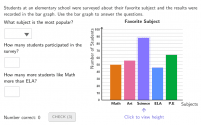
Interpreting Bar Graphs
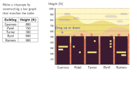
Exploring a Cityscape Bar Graph
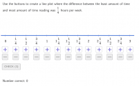
Creating Line Plots
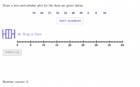
Drawing Box-and-Whisker Plots
Creating Histograms from a Data Table About a Popcorn Party
Creating Scatter Plots
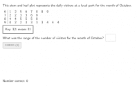
Interpreting Stem and Leaf Plots
Predicting Population Trends Based on a Sample Population
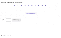
Finding the Interquartile Range
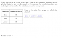
Interpreting Two-Way Tables
SUNY - Stats
Szerző:
MrValencia24
Interpreting Bar Graphs
Exploring a Cityscape Bar Graph
Creating Line Plots
Drawing Box-and-Whisker Plots
Creating Histograms from a Data Table About a Popcorn Party
Creating Scatter Plots
Interpreting Stem and Leaf Plots
Predicting Population Trends Based on a Sample Population
Finding the Interquartile Range
Interpreting Two-Way Tables
Következő
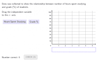
Interpreting Bar Graphs
Új anyagok
z`]]
Trefoil Knot
Hyperbolic Paraboloid
Rose Curve
Nikmati Keunggulan Di Bandar Judi Terpercaya
Anyagok felfedezése
Tabitha Medina Bisecting Segments and Angles
tilted squares
Animation 235
Homothety and Symmetry - George
RegLoc1
Témák felfedezése
Geometria
Halmazelmélet
Tükrözés
Kocka
Másodfokú egyenletek